Thursday, 5 June 2014

Wednesday, 4 June 2014
Monday, 13 January 2014
Thursday, 12 December 2013


MJ: Production Update
For my song advertisement I have decided to go with the version with the smaller, white lettering. This is because the reading line goes straight to Chessie's character, with the blur effect that makes her stand out more and then the path will fall on the text next to her.

The ethereal white effect also brings out the green overtones of the forest scene, which makes the advertisement look pretty as well as standing out from other advertisements.
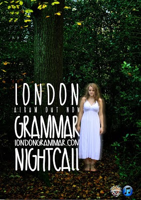
The ethereal white effect also brings out the green overtones of the forest scene, which makes the advertisement look pretty as well as standing out from other advertisements.
Group: Plan For Audience Research
In order to collect as much audience research relating to our video, digipak and advert, we have decided to send out our video campaign via social media such as Facebook and email to gain as many responses as possible. As well as this, we have planned a focus group for Monday to gain more feedback from a controlled demographic of our audience.
After Monday, we will collect all of our results from both methods, and evaluate them.
After Monday, we will collect all of our results from both methods, and evaluate them.
Monday, 9 December 2013
FA: Digipak Update
Whilst Matt has been working on the music video production for some of today, I have been working on my digipak, and have almost finished. Currently, I am just choosing whether to go for a black and white effect, or to keep some colour:

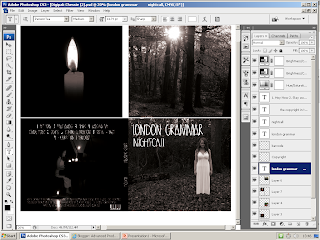
The candle image in the top left is not my own, as I am planning to take an image tonight of the candles used in our first shoot to replace this.

Friday, 6 December 2013
Wednesday, 4 December 2013
Feedback On Progress
Looking a bit on the minimal side you two, I will be checking again tomorrow in which I hope to see some more detailed posts on your progress so far. I also need an update for the music video, I want to see a reworking of the opening performance scene, so you should export your newer version.
MJ: Print Work - Advert Update

In this reworked version of my magazine advert the size of the font has been resized so that it is the same size as Chessie's ghost character.
Tuesday, 3 December 2013
FA: Digipak Progress
Today I have been working on the Digipak campaign. I have transferred my images to Photoshop and have been working on the layout.

Aspects I still need to work on include:

Aspects I still need to work on include:
- changing the font to the chosen one from dafonts.com (I need to download this from the website)
- choosing a more suitable image for the back cover
Monday, 2 December 2013
MJ: Advertisement Progress

For this version of my advert I have edited the picture so that Chessie is on a different layer to the picture. This means that I can alter the colour of the forest whilst Chessie stays the same colour.
For the creation of the titles I used a process in which the whole layer of the picture is copied and then placed over the top of the original, I then used the font tool to write the titles.
It is a very effective look, however some have said that it is quite difficult to read, and personally I feel that, even though I like it a lot, it looks more like it would be more suited to an album for a dance track, rather than a mellow indie track.
Sunday, 1 December 2013
Rough Cut Feedback
1. Some examples of A grade shots, where the footage works particularly well with the music. The concept is appropriate for the sound and the editing is beginning to show good selection of shots.
2. The vignette at the beginning of the wood scene is better than the rather more defined circular one which you then switch to. The shots in the wood need sequencing correctly as the narrative doesn't appear to be in the right order at present. The performance in the hall is much improved and some of the shots on Chessie and tracking in and out are lovely. Not all the pans are working because of background and the angle the camera ends up it. This however could be beautiful, I suggest if you are running out of time, that you export this footage onto another time line on a different computer and each work on a different bit of the narrative.
3. You should shoot performance outside as originally planned, this is what is missing and I think would enhance it.
4. Print work is progressing well. The blur effect on the images - I don't think works. The shot of Matt is appropriate but needs to be a stronger selection from your images. You examples of found images lower down on the blog are good examples. There is clear evidence of a cohesive band image here so it is worth working on the images to get the best ones.
Blog: is showing development of ideas and reflect. You need to ensure that you are using more media terms in your analysis and keep it technical and detailed. Bullet points are better than continuous prose.
5. Your music video is currently a level 3 but could be a level 4 (A) as I have seen the evidence from the shoot. You are losing marks for this part of the criteria: "...including controlled use of the camera, attention to framing, ...and close attention to mise en scene." 26/40 + a mid C.
2. The vignette at the beginning of the wood scene is better than the rather more defined circular one which you then switch to. The shots in the wood need sequencing correctly as the narrative doesn't appear to be in the right order at present. The performance in the hall is much improved and some of the shots on Chessie and tracking in and out are lovely. Not all the pans are working because of background and the angle the camera ends up it. This however could be beautiful, I suggest if you are running out of time, that you export this footage onto another time line on a different computer and each work on a different bit of the narrative.
3. You should shoot performance outside as originally planned, this is what is missing and I think would enhance it.
4. Print work is progressing well. The blur effect on the images - I don't think works. The shot of Matt is appropriate but needs to be a stronger selection from your images. You examples of found images lower down on the blog are good examples. There is clear evidence of a cohesive band image here so it is worth working on the images to get the best ones.
Blog: is showing development of ideas and reflect. You need to ensure that you are using more media terms in your analysis and keep it technical and detailed. Bullet points are better than continuous prose.
5. Your music video is currently a level 3 but could be a level 4 (A) as I have seen the evidence from the shoot. You are losing marks for this part of the criteria: "...including controlled use of the camera, attention to framing, ...and close attention to mise en scene." 26/40 + a mid C.
Friday, 29 November 2013
FA: Digipak Rough Cut

Here is my rough cut of the digipak for our music video promotion. As the 'rough cut' title suggests, the images need some work and are unfinished. The font will be the same but in white so it stands out more. I have gone for a black and white theme here, but may make some alterations as I feel that it does not reflect our video completely as we have decided not to use black and white at all in the production.
MJ: Advertisement Rough Cut

In my rough version of the magazine advertisement so far I have added the picture in, which was originally too small to fit the page, but by copying sections of the picture and merging them with the two sides of the picture I have been able to overcome this problem. Originally the two sides did not look right, but by colour grading the sides using the Curves tool on Adobe Photoshop CS3 I have been able to make them look almost part of the picture.
I have also made the forest a brighter, more ethereal, green by cutting Chessie character out whilst using the Curves function to make the greens brighter.
As for the titles, these will not be used for the completed piece, however I quite like the look of this font, as the way that much of the word blends in with the picture gives it a ghostly feel. However I do still prefer the original, as used on the digipak that will fit with the band image.
Group: Second Rough Cut
As we continue to work on our music video production, we have created a second 'rough cut', where we have put the Vignette Effect onto the video. Again, it isn't complete yet and has its flaws which we will be working on during the next week.
Thursday, 28 November 2013
Group: Rough Cut
When making our rough cut, it was plain to see that we needed to do another shoot to fill up our timeline as we only have about 60% of our footage so far, so we have decided to take another shoot on Friday (29th) of Matt in the woods, and then a performance shoot on Monday (2nd). Apart from having to shoot these other scenes, we feel that since our concept change, we have made some steady progress and are now on our way to confidently finishing in time for our deadline.
MJ: Work Progress
28.11.13
Yesterday Chessie and I spent a combined three hours into the project, attempting to create a rough cut that gives us a basic template of how the video will begin and end, with other shots in the middle. When we had finished we felt much more confident about our project, understanding what needs to be re-filmed or for extra shoots, as well as the amount of footage we have to work on at the moment.
Much of the time was simply spent dropping and dragging clips onto the timeline and editing them there, however when we were more confident with what we had so far we began experimenting with different effects, such as the "Time Stretch" effect, which works very effectively. Also we found some effects in Adobe Premiere Elements don't work in our video, such as the zooming effect.
Yesterday Chessie and I spent a combined three hours into the project, attempting to create a rough cut that gives us a basic template of how the video will begin and end, with other shots in the middle. When we had finished we felt much more confident about our project, understanding what needs to be re-filmed or for extra shoots, as well as the amount of footage we have to work on at the moment.
Much of the time was simply spent dropping and dragging clips onto the timeline and editing them there, however when we were more confident with what we had so far we began experimenting with different effects, such as the "Time Stretch" effect, which works very effectively. Also we found some effects in Adobe Premiere Elements don't work in our video, such as the zooming effect.
FA: Work Progress
28.11.13
Today I have been practicing using a Vignette Effect from Photoshop on still images. I have been using a tutorial which I found:
http://www.photoshopessentials.com/photo-effects/vignette/
This has been very useful and is extremely easy to understand, as for someone who has barely used Photoshop before, I was able to create the following images.


I still need to practise creating this effect on our video, as I assume it will be harder to do create on a moving image. To create a Vignette Effect on our moving image in Premiere Elements, I have created an effect on Photoshop which has a transparent background, which is then layered as a still onto Premiere. Here is an example of this effect created on Photoshop.


Today I have been practicing using a Vignette Effect from Photoshop on still images. I have been using a tutorial which I found:
http://www.photoshopessentials.com/photo-effects/vignette/
This has been very useful and is extremely easy to understand, as for someone who has barely used Photoshop before, I was able to create the following images.


I still need to practise creating this effect on our video, as I assume it will be harder to do create on a moving image. To create a Vignette Effect on our moving image in Premiere Elements, I have created an effect on Photoshop which has a transparent background, which is then layered as a still onto Premiere. Here is an example of this effect created on Photoshop.


Subscribe to:
Posts (Atom)