MJ: Production Update
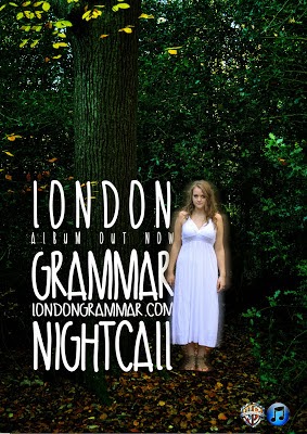
For my song advertisement I have decided to go with the version with the smaller, white lettering. This is because the reading line goes straight to Chessie's character, with the blur effect that makes her stand out more and then the path will fall on the text next to her.
The ethereal white effect also brings out the green overtones of the forest scene, which makes the advertisement look pretty as well as standing out from other advertisements.
No comments:
Post a Comment